Day 10: Making it more fun to play
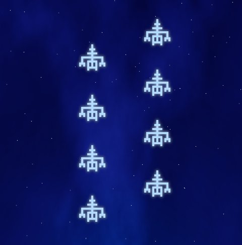
I'm having doubts whether the current concept is fun enough to play longer. Maybe it would be better if aliens would move left and right as well. I implemented that now for two new attack formations and it looks and feels much better. I also added the camera shake code when you hit an alien and it explodes. The game feels more alive now. The reload button works, so now you can empty your 10-bullet clip and have to reload. Makes the gameplay more interesting as you have to break from shooting spree to reload the gun. I replaced the ugly magenta color of some aliens with cold, whiteish blue. It looks much better.

I'm thinking maybe it would be better if player could only touch the lower part of the screen - area within his shield. This way the upper part would always be visible - not hidden underneath player's finger as it happens often now. Maybe if shield is half screen size at start and as enemies hit it, it reduces until the gun is naked and vulnerable. Although, this would mean having to draw a gun as well. Probably not a bad idea though, I might try this.
Star Dust name is taken, I tried some 20+ others, but it seems that it's really hard to find a free name, as there are many space-theme games.
read more... Tweet to @bigosaur Tweet Bigosaur, 2013-10-09
