Day 7: Change of layout and screen orientation
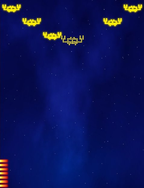
You can shoot aliens now. Since the graphics is retro style, I decided to explode the alien's large pixels (I draw aliens using large zoom tool in Gimp, and then I enlarge the image 5x without any interpolation). I wrote a custom particle manager code and use built in tweening in libGDX to send each piece in a random direction away from center.

You may notice that there is no you on the screen. This is on purpose. In case you did not realize yet, this is a first person shooter. ROFL. Well, at least technically, it is. You don't get to see yourself, you only shoot at enemies. In some test version I also tried to scale the aliens to give a feeling of depth and them coming from far away, but it's hard to shoot small sprites on Android using your finger, so I gave up on the idea.
To make the game more interesting, the laser gun you're using would need reloading. You got 10 shots and then you need to hit the Reload button at lower left corner of the screen. I'm still not sure about this feature - needs testing.
As I was testing this, one thing bothered me a lot: While I shoot the aliens, my index finger is all over the screen and it's hard to see what's going on. Then I looked at different Android games on my phone and realized that it would be much better if screen was oriented in portrait mode. When in portrait mode, your index finger does not come from below, but from right side (if you're right-handed, of course). Most of the screen is still visible in this case. I'm also changing the flying direction. Instead of going from left to right, aliens are coming from the top of the screen.
Because of this, I'm also changing the main game concept. Instead of playing a fixed amount of time, you would play until you allow one of the aliens to get past you. My initial idea was that you would play for one minute and score as many points possible during that time (something like fruit ninja arcade mode). But now I'm thinking you could have 3 lives or something like that, and if you let some aliens pass, it's game over.
I also changed the nebulas in the background. I wrote before about that tutorial how to draw a night sky with stars and nebulas in Gimp, but I had to experiment a bit to get the look I wanted. It works by using Subtract layer effect on two layers with rendered Solid Noise, and then colored using Overlay with a single color and a gradient. The problem is that Subtracting those two layers always created a "small" nebula, while I wanted the whole screen to be full with color. I draw the stars by placing a bunch of random dots using pencil and a couple of different colors. I separated the stars in 3 layers. On one of the layers I added a 2px drop shadow (with no offset), on second one I used blur and I left the third one as it is. The trick to nice stars is that those drawn close to each other should always be different color or have different sharpness. This is the way it is on the real sky. The stars that look close together are lightyears away and only appear close from Earth.
read more... Tweet to @bigosaur Tweet Bigosaur, 2013-10-06
