MMiaW: A second stab at user interface
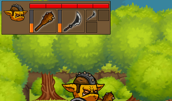
I tried playing the game with the previous UI idea which had a horizontal bar for Health, Mana and Rage. However, it's quite unclear that Mana and Rage are tied to the weapons and items. So, now I'm changing the layout: there's only one Health bar at the top - the Mana and Rage bars will be shown alongside weapons and items that require them.

Don't be confused with the portrait image - I'm currently controlling a goblin instead of the hero, because his animation set is complete.
I think this layout will work, but I'm not really happy with the graphics. Need to experiment with some other designs....
read more... Tweet to @bigosaur Tweet Bigosaur, 2016-03-09
