Use the Landscape, Luke
Just like the last time, I decided that I have to change the screen orientation mid-project. This time from portrait into landscape. Here are the reasons:
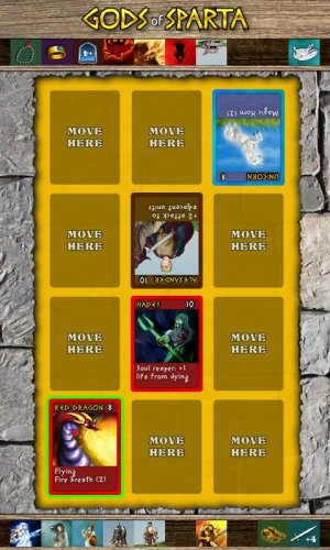
- attack graphics looks odd upside down
- I want to provide hints how damage is calculated, awkward since all the enemy cards are upside down.
- Thumbnails used to pick units from your deck are too small on phones.
- YouTube videos are landscape.
- Desktop version of the game (if I ever release any) can use larger resolution.
- I can test larger resolutions on my monitor instead of having to run it on the Android devices.
- Players will sit next to each other, so they won't have to put the device down on a table to play. You can play it with a friend on a bus or on a train.
- Much more available screen space for unit stack and enough space for additional user interface. See how everything is crammed currently and a lot of space is wasted sideways:

Cons:
- I have to redraw some of the graphics
- I now need horizontally flipped unit graphics which will almost double the memory consumption of the game (I cannot simply flip the whole card, as it contains pregenerated text as well)
- The drafting screen cannot use the rotations to indicate current player
To conclude: unless the game is meant to be played like Flappy Bird (using the same hand that holds the phone and having only one command: “tap anywhere”) use the LANDSCAPE orientation.
read more... Tweet to @bigosaur Tweet Bigosaur, 2014-10-12
